A conversion audit is the process of identifying exactly where potential customers are dropping off and why. Not through guesswork or assumptions, but through a structured evaluation of the specific elements that determine whether a visitor becomes a customer or leaves without taking any action.
For a lot of people, the instinct when a website isn’t generating customers is to send more people to it.
More ads. More content. More SEO effort. More traffic from more channels. The assumption is that volume will eventually produce the results that current volume isn’t producing. So the spend increases, the visitors arrive, and the conversion numbers stay roughly where they were.
Traffic was never the problem. The problem was somewhere inside the website experience itself – in how clearly the value was communicated, how much trust the site built, how compelling the offer felt, how easy the next step was to take. More traffic flowing through a website with conversion problems doesn’t produce more customers. It produces more people encountering the same problems and leaving the same way.
This 7-Part Website Conversion Audit covers the areas that matter most – the places where websites most consistently lose customers they should have kept.
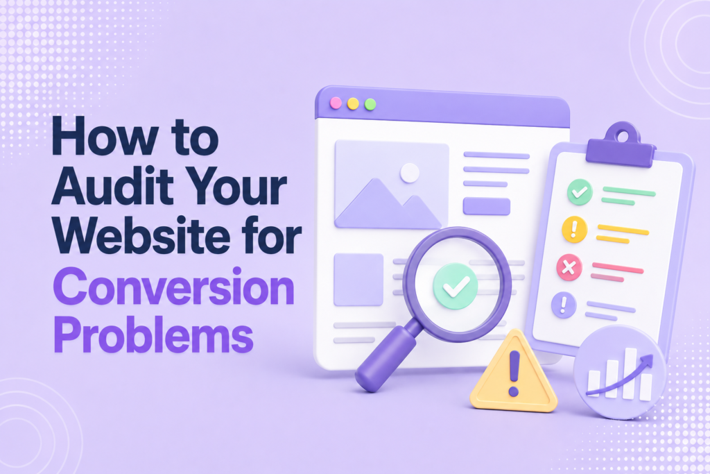
How to Audit Your Website for Conversion Problems
1. Is Your Value Proposition Clear?
The first audit is the most fundamental – and the one most websites fail without realizing it.
When a visitor lands on your website for the first time, they have no context, no prior relationship, and no particular patience for confusion. Within seconds they’re asking three questions simultaneously: what does this business do, who is it for, and why should I care? If those questions aren’t answered immediately and clearly, the visitor leaves. Not after careful consideration – within seconds, before they’ve read a paragraph or scrolled past the first screen.
This is the value proposition test, and it’s stricter than most business owners expect when they apply it honestly.
The test is simple. Find someone who has never seen your website – a friend, a colleague, someone outside your industry – and ask them to look at your homepage for five seconds. Then ask them to describe what the business does, who it serves, and what makes it worth considering. If they can answer all three questions accurately, your value proposition is clear. If they struggle, hedge, or get it wrong, it isn’t – and no amount of traffic will compensate for the confusion that greets every new visitor.
Common value proposition failures follow predictable patterns. The headline describes what the business does in generic terms rather than what the customer gets – “Digital Marketing Services” rather than “We help independent consultants generate consistent client enquiries without relying on referrals.” The above-the-fold content is dominated by imagery or branding rather than a clear statement of value. The language used is internal – industry terminology, company jargon, or process descriptions that mean something to the business but nothing to the customer reading it for the first time.
The fix is always specificity. A value proposition that names a specific outcome for a specific person in specific terms passes the five-second test reliably. One that describes the business in general terms rarely does.
Questions to ask during this audit: Can a stranger identify what we do within five seconds of landing on our homepage? Does our headline describe an outcome the customer wants or a service we provide? Is the language we’re using the language our customers use, or the language we use internally? Is it immediately clear who this website is built for?
2. Does Your Website Build Trust?
A visitor who understands your value proposition faces a second, equally important question: can I trust this business to deliver what it’s promising?
Trust is not assumed online. It’s earned – and it’s earned through specific signals that visitors look for, consciously and unconsciously, every time they evaluate a business they haven’t bought from before. A website that doesn’t provide those signals loses customers who understood the offer but didn’t feel safe enough to act on it.
The trust audit examines whether those signals are present, specific, and convincing.
Testimonials and reviews the most expected form of social proof – but their quality matters as much as their presence. A wall of five-star ratings with no accompanying detail adds little. A specific testimonial that describes where the customer started, what the experience of working with the business was like, and what specifically changed as a result – that adds significantly. The reader can assess whether the situation described matches their own and whether the outcome achieved is the one they’re looking for.
Case studies provide deeper proof for businesses where the work is complex or the investment is significant. A well-constructed case study doesn’t just state that a result was achieved – it explains the starting point, the approach, and the specific measurable outcome in enough detail that the reader understands why the result happened. That mechanistic understanding is what makes the result feel replicable rather than accidental.
Credentials, certifications, and affiliations matter in categories where formal qualification is expected or where the buyer is making a significant investment of money or trust. They don’t need to dominate the page – but their absence in categories where they’re expected creates doubt.
Contact information signals legitimacy in a way that’s easy to overlook. A physical address, a phone number, a named individual behind the business – these details communicate that the business is real, accountable, and findable if something goes wrong. Websites that hide contact information – or that provide only a generic contact form with no other identifying details – create subtle but real unease.
Professional presentation throughout the site is a trust signal in itself. Spelling errors, broken links, outdated information, images that don’t load, inconsistent formatting – none of these are individually catastrophic, but collectively they signal a business that doesn’t pay close attention. And a business that doesn’t pay close attention to its own website probably doesn’t pay close attention to its customers either.
Questions to ask during this audit: Would a first-time visitor trust this business enough to buy from it based solely on what they see here? Are our testimonials specific enough to be convincing or generic enough to be ignored? Do we have documented proof that we’ve delivered the promised outcome for real customers in comparable situations? Is there enough identifying information on the site that a visitor can confirm this is a legitimate, operating business?
3. Is Your Offer Compelling?
Understanding what a business does is not the same as wanting to buy it.
A visitor who has passed the value proposition and trust stages is now evaluating the offer itself – the specific thing being sold, the outcome it promises, what it costs, and whether that exchange feels worth making. A website that communicates clearly and builds trust but presents a weak or poorly framed offer will still fail to convert.
The offer audit examines whether the proposition being made to the visitor is compelling enough to motivate action.
Outcome clarity is the first element. The offer should describe what changes for the customer as a result of buying – not what the customer receives, not what the business delivers, but what the customer’s situation looks like after the transaction. Features describe the product. Outcomes describe the transformation. Customers buy transformations.
Value obviousness is the second element. The customer should be able to assess, without significant mental effort, whether the outcome being promised is worth the price being asked. When value isn’t obvious – when the offer requires interpretation, when the benefits are buried in dense copy, when the price appears without context – the customer defaults to the safest response, which is to do nothing.
Urgency is the third element. Even a visitor who finds the offer genuinely compelling will procrastinate without a reason to act now rather than later. That reason doesn’t have to be manufactured pressure – it can be a genuine constraint, a specific start date, a limited availability, or simply an honest articulation of what the problem is costing them every month it goes unresolved. Without some form of urgency, “I’ll think about it” becomes the default response – and thinking about it, online, almost always means forgetting about it.
Questions to ask during this audit: Does our offer describe an outcome the customer wants or a service we provide? Can a visitor immediately understand what changes for them if they buy? Is the value of that change obvious relative to the price? Is there a genuine reason to act now rather than later?
4. Are You Attracting the Right Audience?
Sometimes the website isn’t broken. The traffic is.
A website can have a clear value proposition, strong trust signals, and a compelling offer – and still fail to convert, because the people arriving aren’t the people the offer was built for. They found the content interesting, clicked the ad, or landed through search – but they don’t have the problem the offer solves, the budget to pay for the solution, or any genuine intention to buy.
Wrong-audience traffic of the most expensive and least diagnosed conversion problems. It’s expensive because it consumes marketing spend without producing revenue. It’s difficult to diagnose because the top-line metrics – sessions, page views, time on site – can look encouraging even when the underlying audience is entirely wrong.
The audience audit examines whether the visitors arriving at the website match the profile of the people the business is designed to serve.
Analytics provide the starting point. Traffic source data reveals where visitors are coming from. Demographic and interest data – available in most analytics platforms – gives a picture of who those visitors are. Behavior data shows what they do when they arrive: which pages they visit, how long they stay, where they exit. A visitor who lands on the homepage, spends thirty seconds, and leaves without clicking anything is behaving very differently from one who visits the homepage, navigates to the services page, reads the case studies, and spends eight minutes on the site. The second visitor is more likely to be a genuine prospect.
Search query data is particularly revealing for businesses that rely on organic search. The specific terms people type to find the website tell you what they were looking for – and whether what they were looking for matches what the business offers. A business that appears in search results for broad, informational queries will attract researchers and students. One that appears for specific, solution-oriented queries will attract people with the problem and the motivation to solve it.
Questions to ask during this audit: Who is actually visiting our website, and do they match our ideal customer profile? Are the traffic sources we’re investing in reaching people who have the problem we solve? Does our search visibility attract people with buying intent or people with general curiosity? Are visitors engaging with the content in ways that suggest genuine interest in the offer?
5. Is There Friction in the Customer Journey?
Friction is anything that makes the process of becoming a customer harder than it needs to be.
It rarely shows up as a single, obvious obstacle. It accumulates in small increments – an extra click here, an unclear instruction there, a form that asks for more than necessary, a navigation structure that requires exploration rather than guiding the visitor naturally toward the next step. Individually these frictions feel minor. Collectively they create enough resistance to lose a meaningful percentage of visitors who were genuinely interested in buying.
The friction audit maps the complete customer journey from first landing to completed purchase and identifies every point where a visitor might hesitate, get confused, or give up.
Navigation clarity is the starting point. Can a visitor find what they’re looking for without effort? Is the site structure logical from the visitor’s perspective – organized around what they need rather than how the business is internally organized? Navigation that makes sense to the people who built the site often doesn’t make sense to someone encountering it for the first time.
Page load speed is a friction point that operates before the visitor has seen any content. A page that takes more than three seconds to load loses a significant percentage of visitors on mobile – not because they made a decision to leave, but because they ran out of patience before the decision had a chance to form. Speed issues are technical rather than strategic, but their conversion impact is as significant as any messaging problem.
Mobile experience deserves its own examination. A website that functions well on desktop and poorly on mobile is losing a substantial portion of its audience before they’ve engaged with any content. Text that’s too small to read without zooming, buttons that are too close together to tap accurately, forms that are difficult to complete on a small screen – these aren’t minor inconveniences. They’re conversion killers for the growing majority of visitors who arrive on mobile devices.
Form length and complexity create friction at the point where interest converts to action. Every field added to a form increases the cognitive and time cost of completing it – which means a higher percentage of people who started the form don’t finish it. The audit question isn’t “what information would we like to have?” It’s “what is the minimum information we need to take the next step?” Everything beyond that minimum is friction.
Unclear next steps create paralysis. When a visitor doesn’t know what to do after reading the content – when the path from interest to action isn’t obvious – they default to doing nothing. Every page on a website should have a clear, obvious next step that moves the visitor closer to becoming a customer. Pages without a clear next step are dead ends that lose the visitor’s momentum at exactly the moment it’s most valuable.
Questions to ask during this audit: Can a visitor move from homepage to completed purchase without confusion at any stage? Does the site load quickly on mobile devices? Are our forms asking for only what’s necessary? Is there a clear, obvious next step on every page? Are there any points in the journey where a visitor would reasonably get confused or give up?
6. Is Your Call to Action Clear?
A call to action is the specific instruction that tells a visitor what to do next. It sounds simple. It’s one of the most consistently mishandled elements on business websites.
The CTA audit examines whether the website is telling visitors clearly, specifically, and compellingly what action to take – and whether that action is appropriately matched to the visitor’s stage in the decision-making process.
Clarity is the first requirement. A call to action that requires interpretation has already failed. “Learn more,” “get started,” and “explore our solutions” are not clear calls to action – they’re vague gestures toward further engagement that don’t tell the visitor what specifically happens when they click. “Book a free thirty-minute consultation” is clear. “Download the guide to generating consistent client enquiries” is clear. The visitor knows exactly what they’re committing to and what they’ll receive.
Visibility is the second requirement. A call to action that exists but can’t be easily found doesn’t function as one. Above-the-fold placement on the homepage, repeated at logical intervals throughout longer pages, and present at the natural conclusion of any page that builds toward a decision – these aren’t design preferences, they’re conversion mechanics. A visitor who has read through a page and is ready to act shouldn’t have to scroll back to the top to find out how.
Commitment matching is the third and most overlooked requirement. The action being requested should match the level of trust and familiarity the visitor has developed at the point they encounter it. A cold visitor encountering a business for the first time is not ready to book a call, commit to a purchase, or engage in a high-stakes conversation. Asking them to do so before that relationship has been established creates resistance and loses the visitor.
A tiered CTA approach serves different visitors at different stages. A primary CTA for visitors who are ready to take the next step toward buying. A secondary CTA – subscribe to the newsletter, download a resource, read a case study – for visitors who are interested but not yet ready to commit. Giving both types of visitor a relevant next step captures more of the available opportunity rather than forcing everyone through the same high-commitment action regardless of where they are in the decision process.
Questions to ask during this audit: Is every call to action on the website specific about what happens when it’s clicked? Are CTAs visible without requiring the visitor to search for them? Are we asking for an appropriate level of commitment relative to the trust the visitor has had a chance to develop? Do we have options for visitors who are interested but not yet ready to buy?
7. Are You Measuring the Right Metrics?
A conversion audit is only as useful as the data informing it – and many businesses are making decisions based on metrics that don’t measure what they think they measure.
The measurement audit examines whether the business is tracking the outcomes that actually matter and whether the conclusions being drawn from available data are accurate.
Vanity metrics are the most common measurement problem. Page views, sessions, impressions, social media followers, email open rates – these metrics measure activity. They tell you that something is happening. They don’t tell you whether what’s happening is producing customers. A website generating fifty thousand monthly visitors and twelve customers is performing worse than one generating five thousand monthly visitors and forty customers – but the first business looks more successful in a traffic-focused dashboard.
Conversion tracking is what bridges the gap between activity metrics and outcome metrics. At minimum, a website should be tracking the specific actions that represent meaningful progress toward a customer – form submissions, enquiry completions, consultation bookings, purchases. Without this tracking in place, there’s no basis for knowing which pages, which traffic sources, and which elements of the site are contributing to customer acquisition and which aren’t.
Funnel visibility shows where visitors are dropping off in the journey from first landing to completed action. If a hundred visitors reach the pricing page and three proceed to the enquiry form, something on the pricing page is creating significant drop-off. Without funnel visibility, that drop-off is invisible – the business knows it’s not converting but doesn’t know where the conversion process is breaking down.
Attribution accuracy matters for businesses using multiple traffic sources. Knowing that customers are converting is useful. Knowing which channels, which content, and which touchpoints contributed to that conversion is what makes marketing investment decisions intelligent rather than arbitrary.
Questions to ask during this audit: Are we tracking the specific actions on our website that represent genuine progress toward a customer? Do we know which pages have the highest drop-off rates and why? Can we identify which traffic sources produce the most customers rather than just the most visitors? Are the metrics we report on internally connected to revenue outcomes or activity outcomes?
The 7-Part Website Conversion Audit Checklist
Run through this checklist as a quick diagnostic before investing in any additional traffic or marketing spend. Each item is a yes or no evaluation. Every no is a conversion problem worth fixing before more visitors are sent to encounter it.
Clarity
Can visitors understand what the business does, who it’s for, and why it matters within five seconds of landing on the homepage? Does the headline describe an outcome the customer wants rather than a service the business provides? Is the language used the language the customer uses rather than internal terminology?
Trust
Are there specific, detailed testimonials from customers in comparable situations? Is there documented proof – case studies, results, credentials – that the business delivers what it promises? Is the business clearly identifiable as real and legitimate through contact information and professional presentation?
Offer
Does the offer describe a transformation rather than a transaction? Is the value of the outcome obvious relative to the price? Is there a genuine reason to act now rather than defer the decision indefinitely?
Audience
Do the visitors arriving at the website match the profile of the people the offer was built for? Are the traffic sources being used reaching people with the problem the business solves? Does search visibility attract buyers or browsers?
Friction
Does the site load quickly on mobile devices? Can a visitor complete the journey from homepage to enquiry or purchase without confusion at any point? Are forms asking for only the minimum information necessary? Is there a clear next step on every page?
Call to Action
Is every call to action specific about what happens when it’s clicked? Are CTAs visible without requiring the visitor to search for them? Is the commitment level of the primary CTA appropriate for a visitor who has just encountered the business for the first time?
Measurement
Is conversion tracking in place for the specific actions that represent genuine progress toward a customer? Is there funnel visibility showing where visitors drop off in the journey? Are the metrics used internally connected to customer and revenue outcomes rather than traffic and activity?
What the Audit Reveals
Websites don’t fail because of a single catastrophic flaw. They fail because several small conversion problems compound quietly over time – each one losing a percentage of visitors that should have become customers, each one invisible without a structured evaluation to surface it.
A value proposition that’s eighty percent clear loses some visitors in the first five seconds. A trust section that’s present but not specific enough loses more at the evaluation stage. An offer that’s compelling but lacks urgency loses more at the decision point. A CTA that’s vague loses more at the action stage. Individually each loss is modest. Collectively they represent a significant portion of the customer acquisition opportunity that the traffic was paying to create.
The businesses that generate customers consistently online aren’t necessarily the ones with the most traffic, the biggest budgets, or the most sophisticated marketing strategies. They’re the ones that identified where their website was losing people and fixed those problems before investing more in sending people to encounter them.
The audit is where that process starts. Fix what it reveals, and the traffic you already have becomes more valuable than whatever additional traffic you were planning to buy.